Examples of Real World Magazines - Music


- Contents Pages


- Double Page Spread


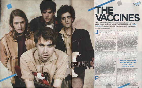


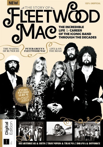
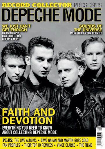
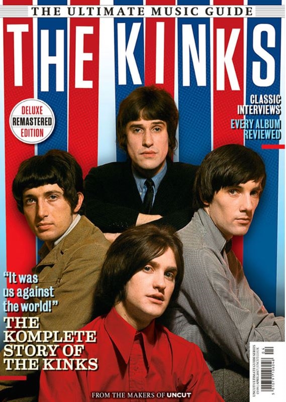
Strengths present within the vast examples of magazines (including DPS' and contents pages) would be the layouts on the covers which use multiple people of whatever band is being shown within typical magazine format (e.g. masthead at the top with a headline beneath; tag lines and pull quotes surrounding the bands presented). This in conjunction with consistent (typically low-key) colour schemes and lighting with mixes of vibrant colours to contrast, whether this be background elements or text colours. Font use follows a stylised font for the band name (as the headline) and typically sans serif styled font for taglines like in 'The Kinks' or 'Fleetwood Mac' magazines. Mis En Scene is typically either formal or stylistic (stereotypical of rock band) clothing with backgrounds which consist of colours that compliment the editing of the magazines (e.g. fonts). These elements are consistent in contents and the DPS'; the best example I'd be most likely to follow would be the magazine featuring Billie Eilish on the contents. The text seeming to be part of the background with Billie's shadow effecting it. However, the busier layout of Kerrang with the repeating use of images linking to the bands present in the magazine is also an option and an opportunity for/to include a variety of images. The DPS' following the theme of a main image which takes up the background with segmented chunks of text is something I'd aim to pastiche.
A common theme within the articles of the magazines (music/rock genre) would be interviews with members of whatever band is being shown within the magazine, giving the audience a unique insight into the world of rock culture and its pioneers. This appeals to a teen/adult audience due to the primary demographic of rock being teens and some adults, with the information on the articles allowing them to find out personal details about whatever bands they're interested in. These articles connote a music based magazine simply due to the denotation of musicians alongside musical equipment which connotes their success as musicians with flashy band equipment and expensive, unique clothes to distinguish themselves with like on the DPS of Fleetwood Mac. I would use the drop caps in the Fleetwood Mac and The Vaccines DPS'.
Influences
- Billie Eilish contents page (background and foreground/editing seeming to be part of each other with one person on the contents page) - I have chosen this due to the effect created in the blending of background/foreground and text elements and the showcasing of a single band member for effect
- Fleetwood Mac DPS layout (main background image of band members with surrounding and segmented text) - I have chosen this because it allows for the whole band which is being spoken about to be an omniscient presence within the DPS so that the reader can see the people that are being spoken about, also connoting a feeling of exclusive, behind the scenes look at the band all together with exclusive interviews.
- Multiple band members as main cover image with a masthead and headline which nicely contrast background colours - I have chosen this so that the whole band being denoted by the masthead are visible so that they can compliment it; also denoting the magazine in the music genre, showing a local Sheffield band. The choice to compliment the background editing elements to the natural back and foreground made by the main cover so the magazine is more visually appealing. Likely using the low key colours seen in the Depeche Mode magazine for the main image.


No comments:
Post a Comment